Frye Art Museum

Gallery Prototye
Web Kiosk EmbARK responsive template design for Frye Art Museum
ROLE
Interaction Design, Prototype Design, User Research, Usability Test
TEAM
A team of four in Capstone Project in School of Visual Concepts UXCP
TOOLS
Figma, Photoshop,
Powerpoint, Google Suite
TIMELINE
9 weeks
BACKGROUND


Frye Art Museum is a Seattle-based art museum that showcases local and global artists exploring contemporary issues and historical matters. They need a new Collection Page template using Web Kiosk (web-based software program) that can seamlessly and visually integrate with the rest of their websites. Below are three main problems we identified:
1
Searchability
No filter and functioning search bar
2
Navigation
Not mobile-friendly
3
Accessibility
Small fonts and low contrast
GOAL
Improving gallery page experience for Frye Museum Staff and colleagues.
APPROACH
CONTEXTUAL INQUIRY
We began doing contextual inquiry with three of Frye Art Museum members by asking them to identify pain points of the current Collection Page:
Collection Page needs a filter to do advanced searches
Unable to identify which artwork is currently “on view”
Search bar does not pull results from the website database, but links to Google search instead, so it doesn’t give users a specific search results
Unable to search by artist and accession number
Collection Page uses small font size with low contrast and incorrect hierarchy that makes getting the most important information difficult
“The artist A-Z letter or filter at the top of the page does not work”
-Frye staff member
COMPETITIVE ANALYSIS
We analyzed three art museums that were recommended by our client: Gardner Museum, MOMA, and The Broad. Additionally, we showed all three sites to Frye Museum staff members to identify features that they liked including:


Gardner Museum
Filter and pagination
High contrast
Alphabetical artist filter
Pagination
MOMA
Search and advanced filter
Functional search bar
Users can filter a range of time period, “Has image”, “Recent Acquisition”, and “On View”
The Broad
Sort function
Users can choose how to view the search results
SOLUTIONS
SEARCHABILITY
“The current Collection Page has no functioning search bar or filter“

Pain point: The search bar is not functional, it pulls results from Google and not Frye’s database.

Pain point: Unnecessary amount of text under a thumbnail that could be reduced.
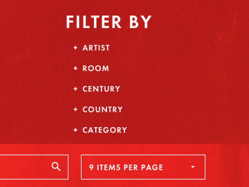
SOLUTION: ADVANCED FILTER
Founding Collection Page contains thousands of artworks.
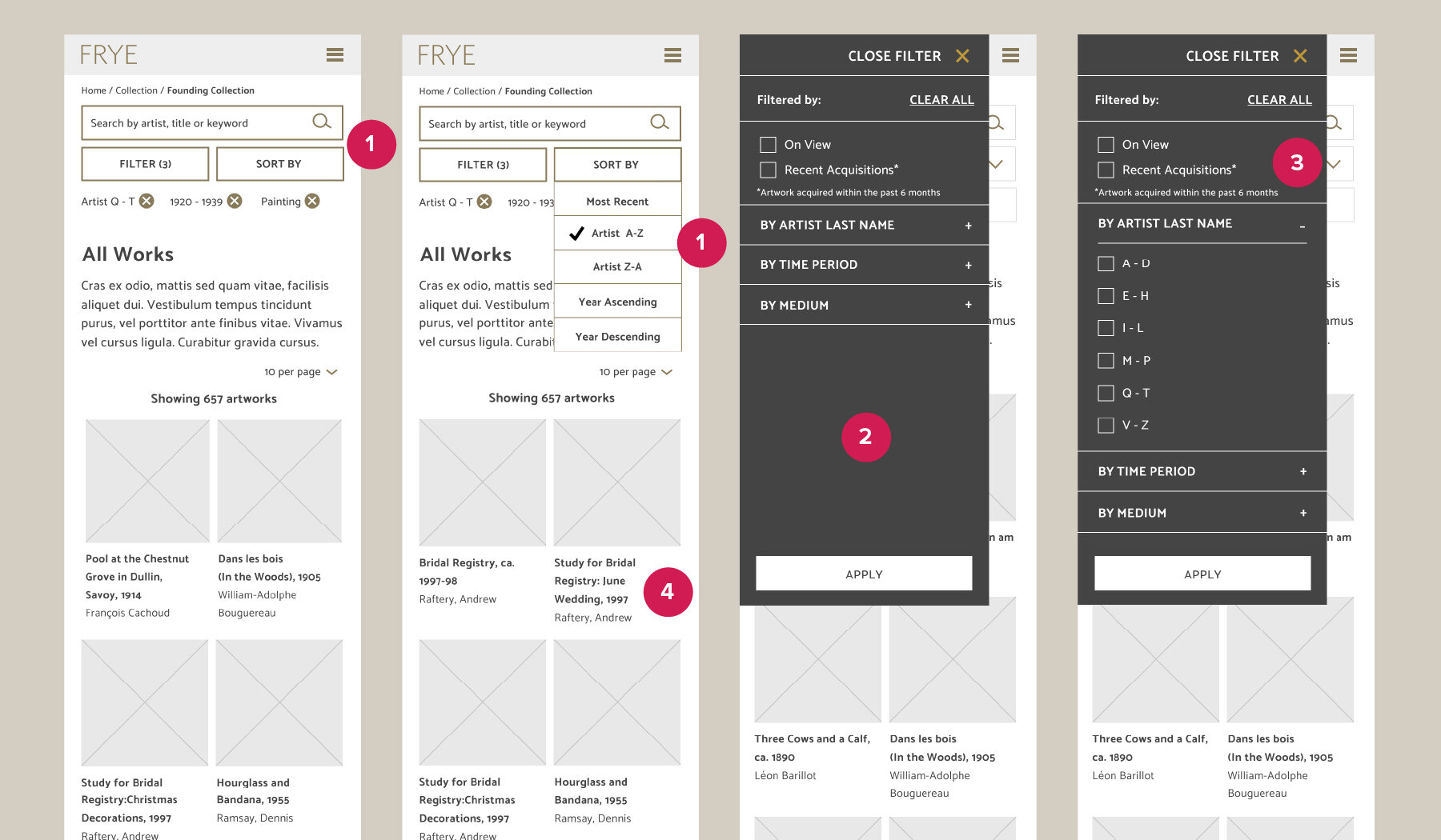
1
Search, Filter, and Sort functions
All functions need to be “sticky” and omnipresent at the top of the page to make it easy for users to find at all times. Sort by allow user to choose how to view the search result.
2
Filter
I designed the mobile filter as a slider that shows up from the left side of the mobile presentation. Users can now filter artwork using artist name, time period, and medium.
3
Checkboxes
We added checkboxes for “On View” and “Recent Acquisitions”. To make it more user-friendly, we added “Close Filter” next to the “X” mark to close.
4
As needed information hierarchy
Display only title and name of the artist under the thumbnails. Then click to get more information.
NAVIGATION

Pain points in artwork thumbnails:
Clicking thumbnail images only enlarges photo but does not give more information.
No “Artwork Detail Page” available.
Artist name and artwork title are not clickable.

Pain points in navigation:
Primary Navigation is missing “On View” and “All Works”.
Inconsistency between Mobile & Desktop: Collection Page does one exist in Mobile.
SOLUTION: NEW COLLECTION PAGE STRUCTURE

1
New Secondary Navigation
We restructure the Collection Page into five secondary navigations: On View, All Works, Founding Collection, Past Exhibition, and Research.
2
Mobile & Desktop
Secondary navigation will show up on both Mobile and Desktop. To accommodate technical limitation, we added “Collection Home” to allow mobile users to have the same experience as desktop.
SOLUTION: NAVIGATION DETAILS

My goal is to improve ease of navigation and helping user find specific artwork.
1
“On View” tags on both thumbnails and Artwork Detail Page to indicate if this artwork is currently on display at the museum.
2
Pagination is the option to choose how many thumbnails are being loaded on a single page. This function works the best for users looking for specific artwork.
3
Artwork detail page is a dedicated page for every single artwork containing historical, technical, artist information as well as other suggested artworks.
4
Breadcrumbs exist on every single Collection Pages to indicate where users are located in respect to rest of the collections.
5
Technical artwork details will be present on each artwork to allow both Frye museum staffers and visitors to gain more information.
6
Artist page contains information about individual artists with more artworks by this artist section to promote more browsing.
ACCESSIBILITY


“I always expect to have to lean in to read the fine print.” - user interview
Pain points: Font too small, low contrast, and missing alt text
Current Frye Art Museum website failed all accessibility tests.
Our team interviewed 7 museum visitors, 4 of whom were seniors. 71% of users interviewed had difficulty reading the text on the Founding Collection page
We ran an accessibility test using https://wave.webaim.org/ and the site failed to meet requirement. My recommendation is to use thicker font style, increase font size, and to design the site with higher contrast.
SOLUTION: WEB STYLE GUIDE

We provided the client with a web style guide to assist them in streamlining the higher contrast, legible type sizes and colors to match the rest of Frye Art Museum’s Brand Guidelines.
RESULTS
“I love it, I would be lost on there for hours!”
USABILITY TESTING
Our team did two rounds of prototype testing, the first focused on functionality and architecture, the second focused on microinteraction and design refinement. We approached this by doing a “think aloud task exercises” to find: (1) a specific artwork by a specific artist, and (2) to test accessibility by making user read a certain text line.
ADDITIONAL LEARNING
The phrase “On View” was a jargon that is hard to understand by both native English speaker and other language speaker. It means artwork that are currently being shown physically at the museum. Our team suggested using words that are translatable such as: “Current Exhibition” and it was received well by the client.
SYSTEM USABILITY SCALE
We ran a SUS on eight individuals with our prototype.

100% of users did not feel they needed to have tech support help them use the system.

Seven out of eight users felt very confident using the system.

75% of users enjoyed using the system and thought the various functions in this system were well integrated.
FUTURE SUGGESTIONS
• QR Codes for artwork that is on display
• The ability ‘Like’ or ‘Save artwork
• Audio Files
• Accessibility and Language Applications