ORCA WEBSITE

Improving UX writing through Usability Heuristics.
Defining product voice to improve efficiency, trustworthiness and accessibility of orcacard.com
ROLE
UX Writer
TOOLS
Adobe XD
TIMELINE
4 weeks
PROBLEM
The ORCA website is where public transit riders can purchase and refill the ORCA card that can be used to pay their fare on buses and trains in the Puget Sound region. Transit websites are challenging because they cross consumer usage and governmental infrastructure that are complex with requirements and there isn’t a focus on a single user group. The site is rich in content with little organization and many unclear terms and jargon that can intimidate users.
My UX writing recommendations will be focused on two things:
Information architecture
Primary navigation, top header, and bottom utility footer.
One purchase flow
Purchasing and adding value to adult unregistered ORCA card.
PROJECT GOAL
Improve the efficiency, trustworthiness and accessibility of orcacard.com as an information hub for public transportation by defining product voice and applying Usability Heuristics.
APPROACH
USERS
As a class, the teacher and students started by doing some desk research about ORCA.com and created an affinity map to find out who is our audience? Since ORCA is a public service website, the UX writing has to accommodate a very wide range of users from local residents to visitors, all ages, disabilities, and a variety of income levels.
USER GOALS:
Get to where they are going
Ensure they have enough fare in their ORCA card
Buy the least expensive option to get what they need
PRODUCT VOICE AND TONE
To find out what voice and tone would be the most appropriate, we conducted a study in class to learn what voice attributes and principles would help orcacard.com users the most. We found that efficient (but still human), trustworthy (but still approachable) and clear (but still friendly) were important principles to apply. Content (the information conveyed or emphasized), verbosity (How many words are used to convey information) and vocabulary (word choice, terminology, jargon) were also important attributes to have.
Efficient
Task driven
Instructional
Organized/ structured
Simple progression of steps
Trustworthy
Explanatory and thorough
Use common terms like other sites
Consistent vocabulary throughout ecosystem
Verbosity
Concise
Minimal number of words
Clear
Specific
Accurate
SINGLE PURCHASE FLOW
Purchasing and adding value to adult unregistered ORCA card.
I went through the steps of what a user would take to buy an ORCA card through the site, to confirm each step that needed to be taken. Currently it takes 9 steps from home page to purchase confirmation.

SOLUTIONS
USABILITY HEURISTICS
I am using Usability Heuristics from Strategic Writing for UX by Torrey Podmajersky to measure the success of my project.
Accessible
Available in multiple languages.
Reading level is below 7th grade (general).
Purposeful
Meeting consumer and business needs.
Conversational
The words, phrases and ideas are familiar to the people using it.
Concise
Buttons have three or fewer words.
Information presented in a need to know basis.
Clear
Good confirmation of progress through flow and of final purchase.
Terminology is used consistently.
PRIMARY NAVIGATION (CURRENT)
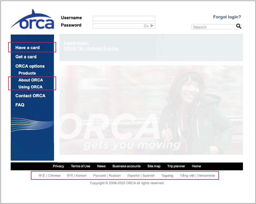
Pain points
“Have a card” contains login and account logistics, but the way it is worded is unclear.
The most important information for users is “about ORCA” and “using ORCA”. Currently, it is hidden under “Orca Options”. These need to be brought forward.
Language options on the footer should be brought to the header to accommodate users with different languages.
“Home” button on the footer is redundant.
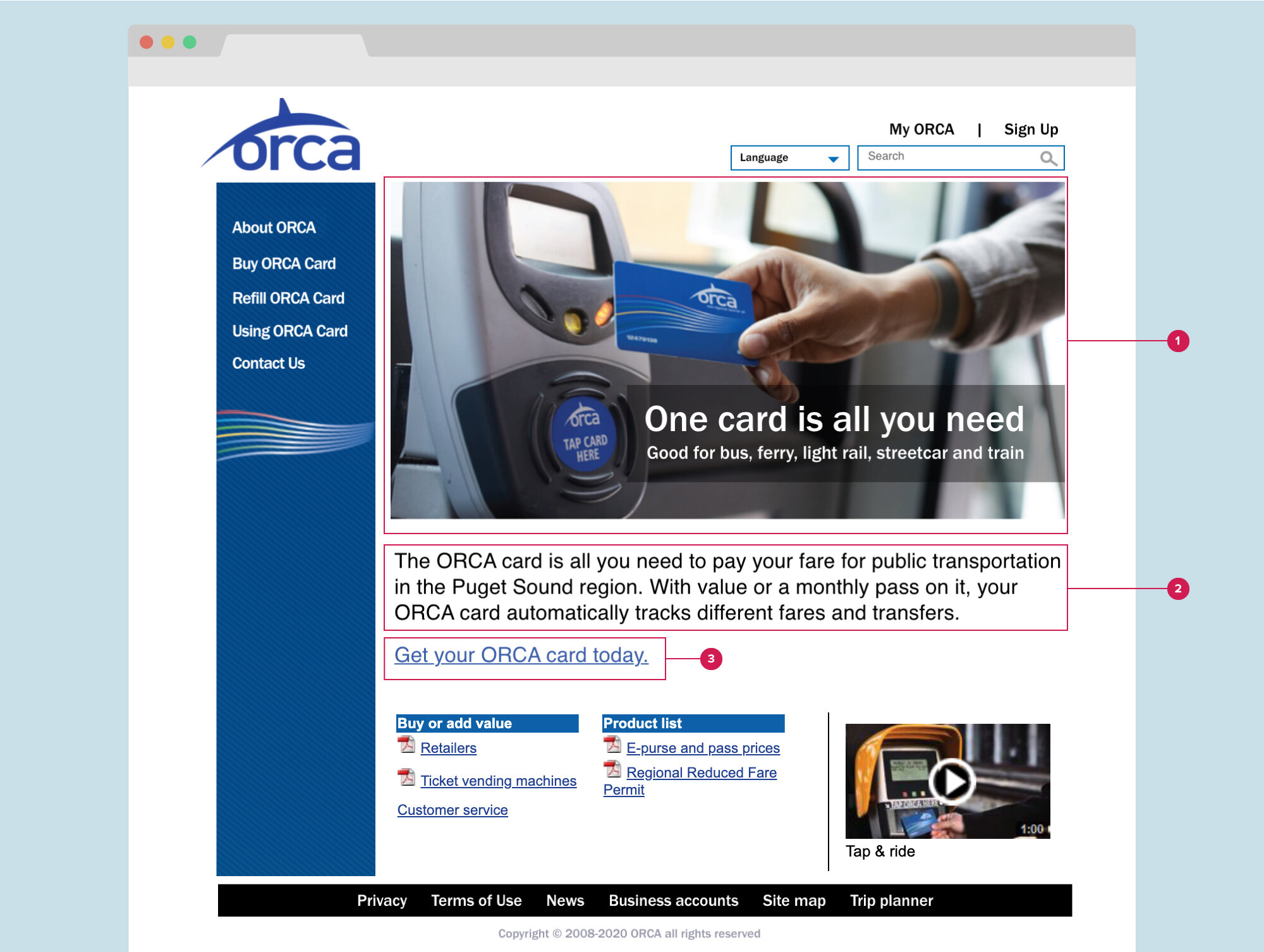
PRIMARY NAVIGATION (UX REWRITE)

1
CONVERSATIONAL
I’ve rewritten and rearranged the primary navigation to About ORCA, Buy ORCA Card, Refill ORCA Card, and Using ORCA Card. These decisions were based on the most important data users need, which is to know what the ORCA card does, and how to use and refill them.
2
ACCESSIBILITY
Language options have been placed on the header for maximum visibility in the form of a dropdown button
3
ACCESSIBILITY
My ORCA signifies the account a user can make in this site, it was previously placed on inside “Have a card” menu. Sign Up button replaced the form input to simplify the text field for username and password.
HOME PAGE (CURRENT)

Pain points
The image on homepage does not provide enough context.
The text under the photo are very detailed but does not provide a high-level explanation of what ORCA card is.
Call to action is small and lost under the arrowed list.
HOME PAGE (UX REWRITE)
1
PURPOSEFUL, CONCISE
I’ve rewritten the overlay text on the image to “One card is all you need…” to be more explanatory and thorough. There is only one image in the entire site. The image should be instructional, like someone using an ORCA card on a reader on the bus.
2
CONCISE,
CONVERSATIONAL
Text under the image has been rewritten into a short, informative phrases that uses common vocabulary.
3
CLEAR
Call to action has been rewritten to have unambiguous results with blue color and underline to indicate a link.
GET ORCA CARD PAGE (CURRENT)

Pain points
“Get a card” is the most important page on the site. There are three different ways to purchase (online, mail, and in person) and age group.
Under Online purchase option, the focus seems to be confusing between logging in, registering, and link to purchase is hidden at the bottom of the section.
GET ORCA CARD PAGE (UX REWRITE)

1
CONVERSATIONAL, CLEAR, ACCESSIBLE
To solve the density of text, I went with table design. Since age group determine how a user can buy an ORCA card, they are highlighted on the top of table.
2
CONVERSATIONAL, CONCISE
To simplify content, I’ve shortened the Ordering Adult card online section to only nine words.
3
ACCESSIBLE, PURPOSEFUL
I’ve added missing information from KingCounty.gov. That includes option to Buy by Phone, ORCA LIFT program, ORCA Go to Events for seniors.
CONFIRMATION PAGE (CURRENT)

Pain point
At a quick glance, the “Thank you” section is small and hard to see, making me unsure if I have finished with the purchase transaction
CONFIRMATION PAGE (UX REWRITE)

1
CLEAR, PURPOSEFUL
“Thanks for your order” should be using larger, bolded typeface, and friendlier language to call attention.
2
CONVERSATIONAL, PURPOSEFUL
Order arrival estimate information has been added so user can expect when their card will arrive (five to seven business days).
3
ACCESSIBLE, PURPOSEFUL
ORCA Customer Service section has been added for easy access to get assistance.
CONCLUSION
KEY TAKEAWAYS
How language, voice, and tone play crucial part in helping consumers and businesses meet their goals. Usability Heuristics can also be applied to measure UX content.
WHAT CAN I CHANGE?
Test the prototype by having ESL speaker users.
Currently it takes eight steps/pages to purchase an unregistered Adult ORCA card. Would like to reduce them.
Simplify the underlying purchase process - How might we set up pay as you go or automatic filling so that ORCA users will never be out of fare?
Could use more how-to-info for terminology like “reduced face”, “transfers”, “electronic pass”