GREEN LAKE JEWELRY WORKS

User-centric responsive interaction site design
A project from Interaction Design class at School of Visual Concepts.
ROLE
Interaction Designer, Information Architecture, Wireframing & Prototyping, Usability Tester, Branding & Typography, User (customer of client)
TOOLS
Sketch, Illustrator, Photoshop
TIMELINE
7 weeks part-time
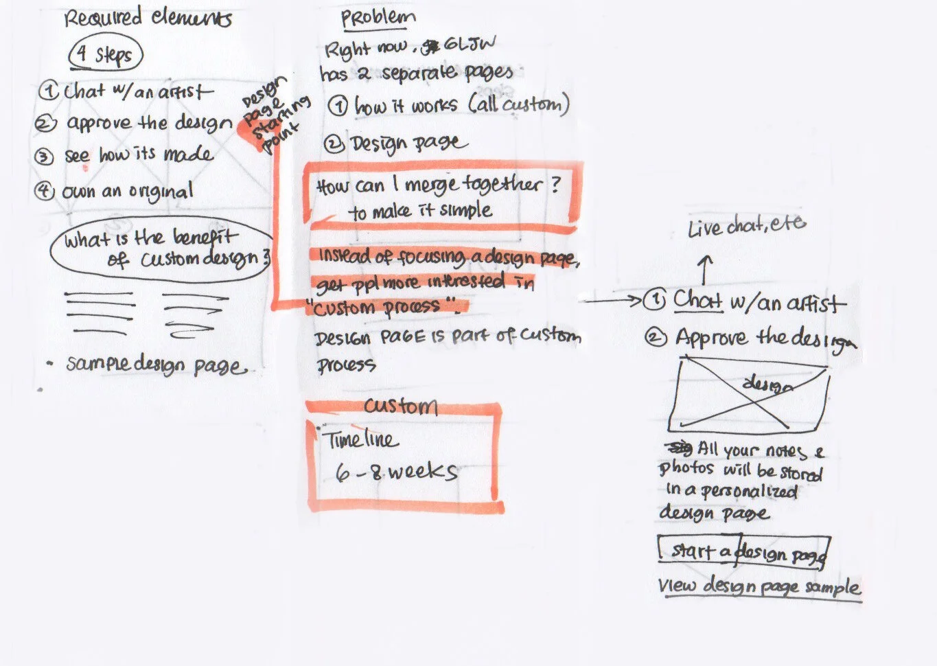
PROBLEM
Green Lake Jewelry Works is a customer-centric jewelry retailer that focuses on unique custom engagement rings designs. Their mission is to go above and beyond industry standards in diamond sourcing, quality, ethics and sustainable best practices. What set them apart from other custom jewelry company is pairing personal jewelry designer with each customer and a platform called Design Page, where customers can communicate directly with designers.
Information Architecture
Unclear language in primary navigation.
Unique offerings
Personal jewelry designer offering and Design Page need to be more prominent.
Not mobile-friendly
The current site is not mobile friendly.
GOAL
Help users navigate complex custom jewelry design process by making resources and support accessible.
APPROACH
RESEARCH
I started by doing desk research on usability tasks of user’s needs throughout the lifecycle. From here, I found out which pain points are the most impactful to improve on to hit my problem-solving goal.
Three categories of user needs throughout custom jewelry design process:
Customer’s logistics
Budget
Custom jewelry timeline (6 weeks or more)
How to shop
Authentications and certifications
Selection/ purchase
Types of gemstones
Lab diamonds
Gemstone shapes
Ring setting style
Metal choices
Care and services
Jewelry cleaning
Safety check for warranty
Ring re-sizing
Repairs
After learning about user needs, the next step is to re-create the site map.
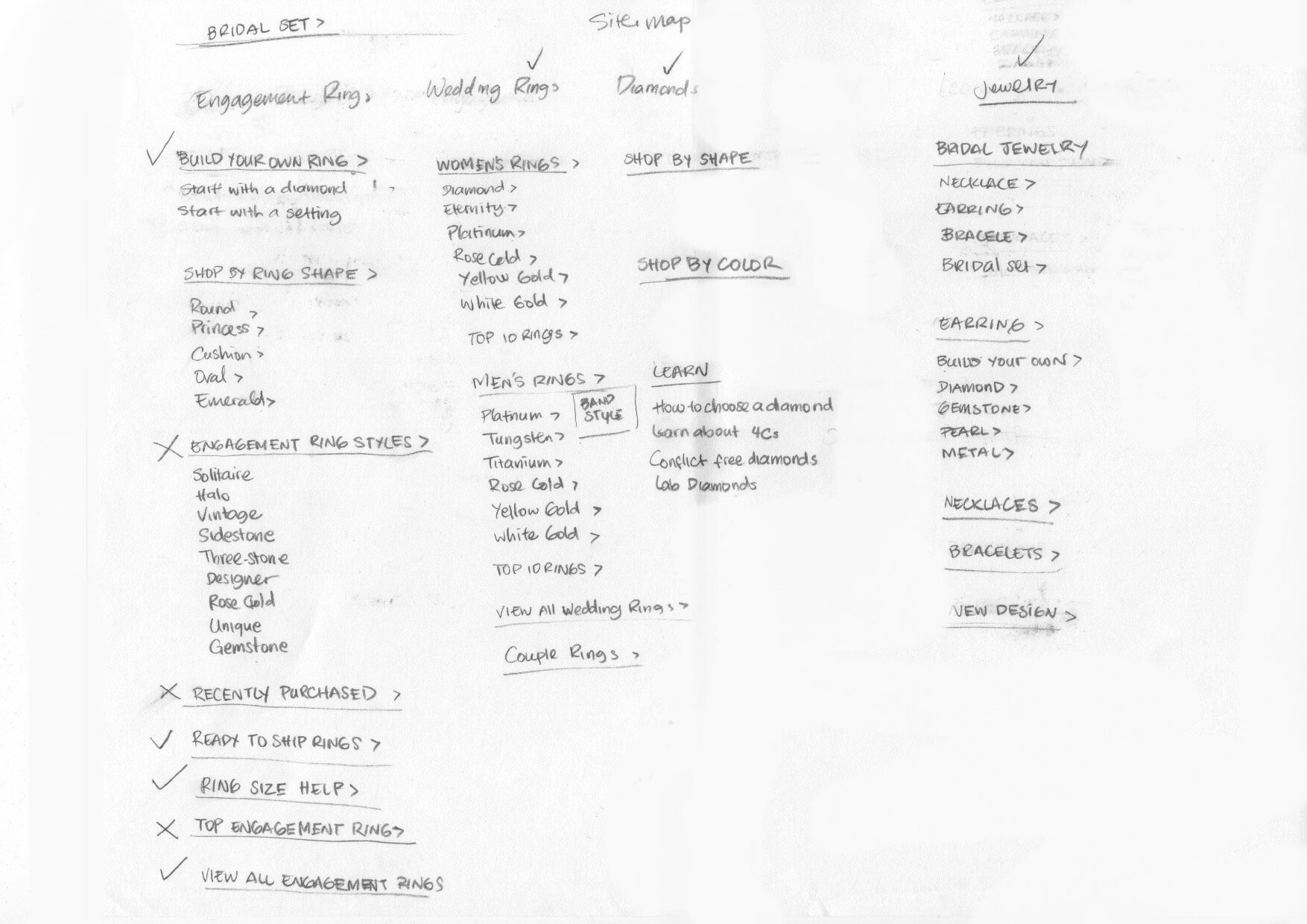
I started by listing current items from the website to match the list of user needs. The next step was to prioritize the first navigation items to match the business description.
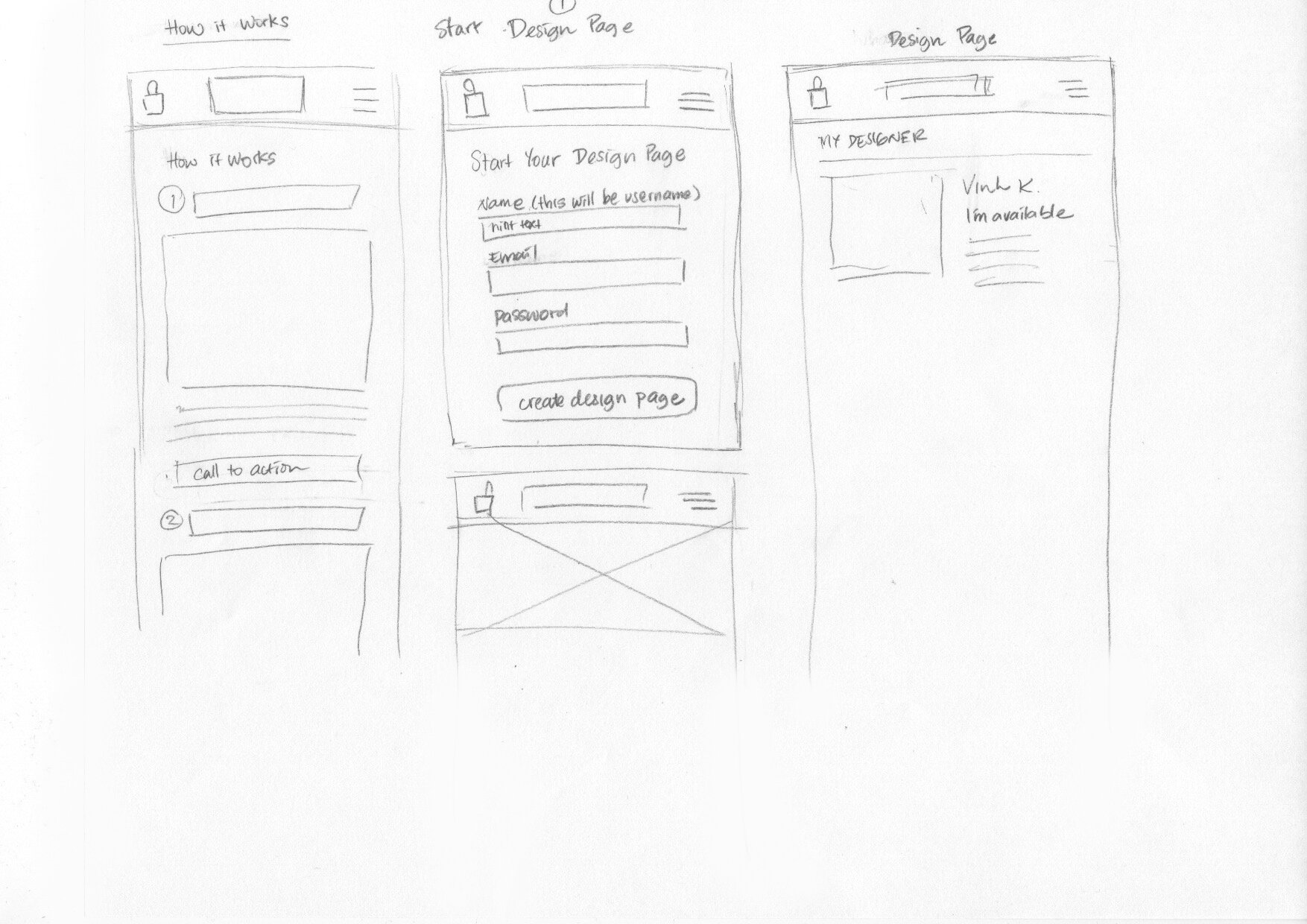
MOBILE PAPER PROTOTYPE
After research I did a Usability Test test on 2 of my colleagues using a paper prototype. I asked them to do a simple task and observe their interaction and behavior on four page designs.
Home Page learnings:
Users found the placement of hamburger menu (on top left) is hard to tap and does not look interesting.
User feels the homepage does not have enough context about the business.
Clickable images on homepage needs clear call to action.
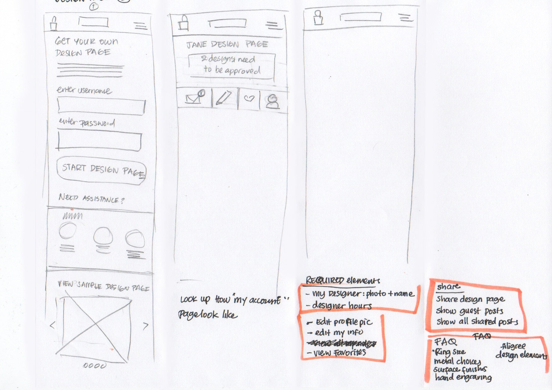
Design Page learnings:
User wants to know if they get to choose a designer, or if a designer will be chosen for them.
A user expected to see chat features and projects library.
Ability to “favorite” designs.
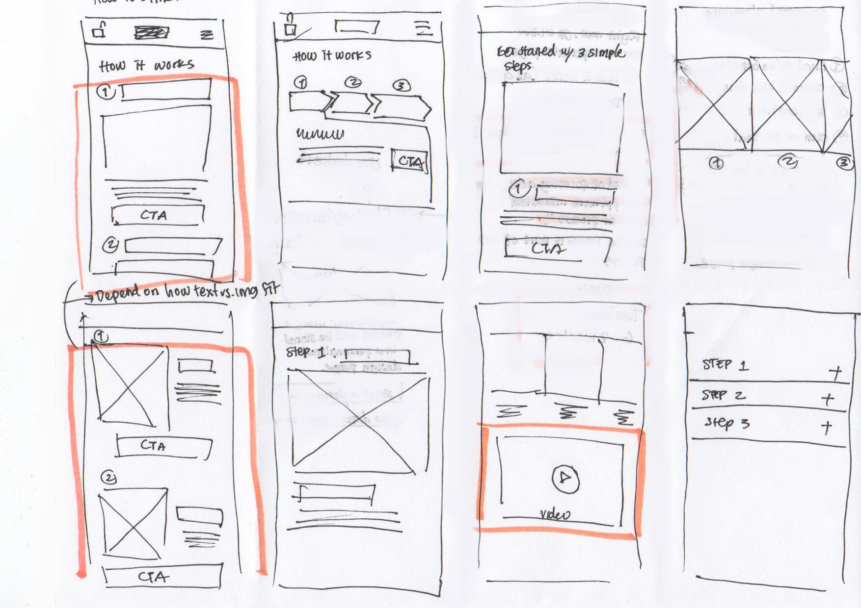
Create your Own Page learnings:
Users thinks the small amount of text per page is more comfortable to read with the option to dig deeper.
A user suggested having a video to accommodate different learning styles.
Users prefer the top to bottom layout vs. horizontal chevrons design (that I originally had).
SOLUTIONS
INFORMATION ARCHITECTURE

Pain points:
Heavy secondary navigation.
No clear distinction between in-stock vs. custom process.
What is the difference between “Custom Jewelry” and “Design your Own”?
SOLUTION: REVISED SITE MAP

The primary nav has been simplified to five sections with the focus to distinguish Our collection and Create your own.
Our collection contains existing custom designs, styled collection, in stock items for quicker purchase, and accessories.
Create your own highlights the custom process, jewelry designers, and Design Page.
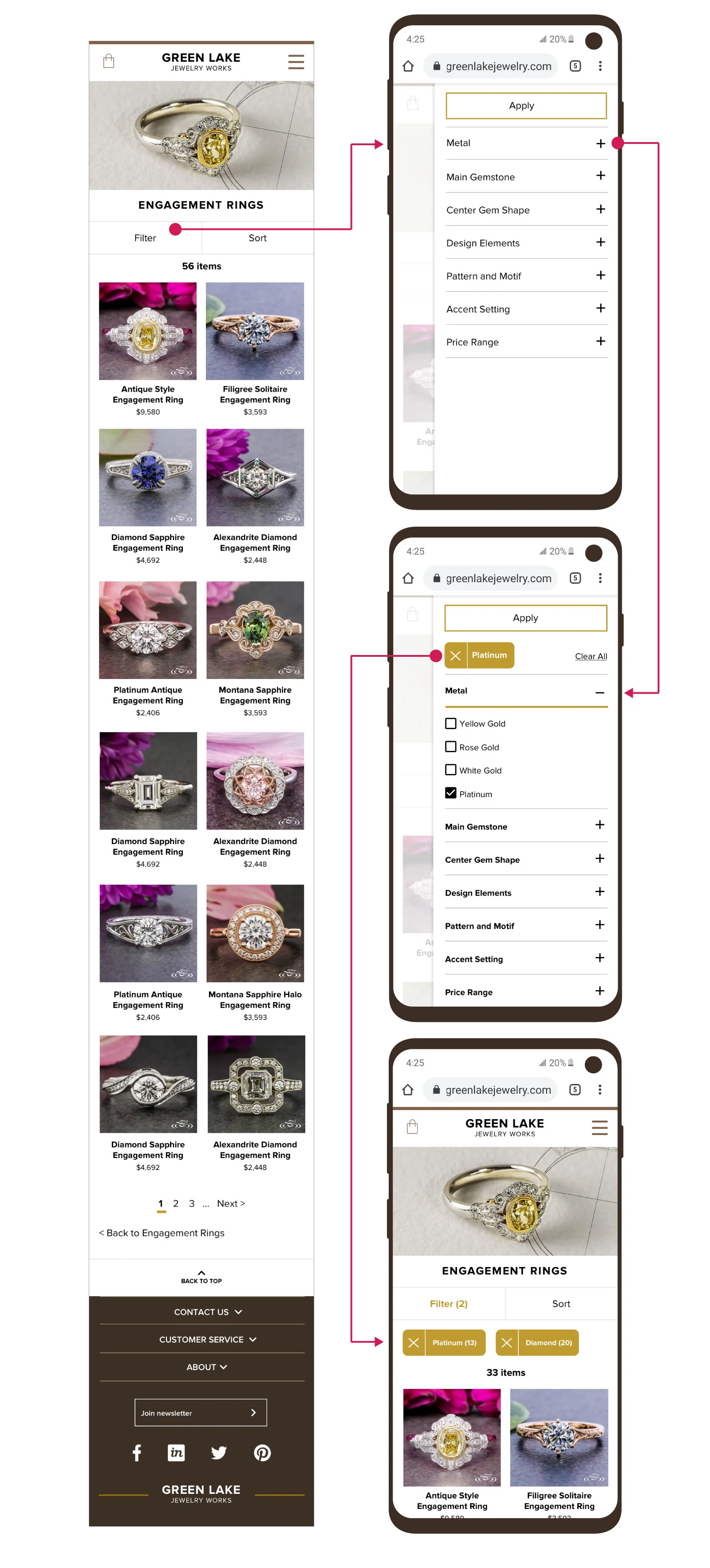
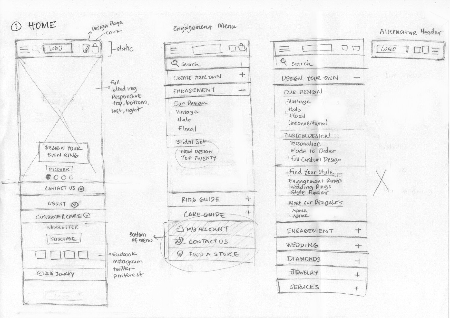
SOLUTION: NEW NAVIGATION

1
Hover state will show the secondary navigation indicated by an underline.
2
Design Page and Cart are placed on top right, while Search is on the top left above primary navigation.

1
Hamburger menu contains primary navigation, search and design page. Cart is located at the top left of the menu.
2
Search bar is located at the very top, underneath the logo, with an enticing phrase.
Design Page is located static at the bottom of primary navigation.
3
Selected primary navigation is indicated by an underline and left-side arrow.
Secondary navigation is being shown underneath the primary with right side arrow.
4
Tertiary navigation is shown with a sentence case and regular font.
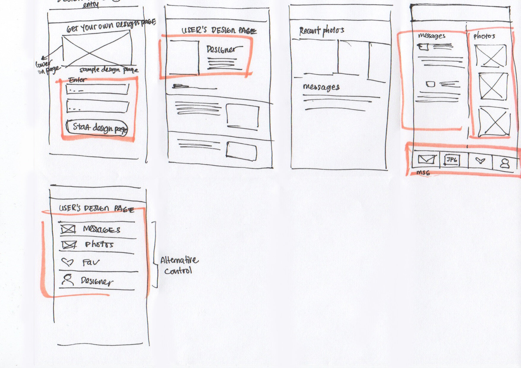
DESIGN PAGE

Design Page is located in the primary navigation without much explanation.
“Sign In“ also leads to Design Page.

Not optimized for mobile.
Chat box is too large and positioned at the top, and display the most current message from top to bottom, opposite from most messengers.
SOLUTION: NEW DESIGN PAGE

1
Chatbox is a sticky feature that stays at the very bottom of the browser. Ability to attach photos and take a picture both on mobile and desktop.
2
Users have the ability to access save Favorites, access Projects, and adjust Settings.
HOME PAGE

Pain points:
Home page looks like a infinite ad listings with outdated look
Too much information is being presented all at once but no focus on business offerings.
“I can’t tell if this is a home page or product page“ - user comment
SOLUTION: NEW HOME PAGE DESIGN
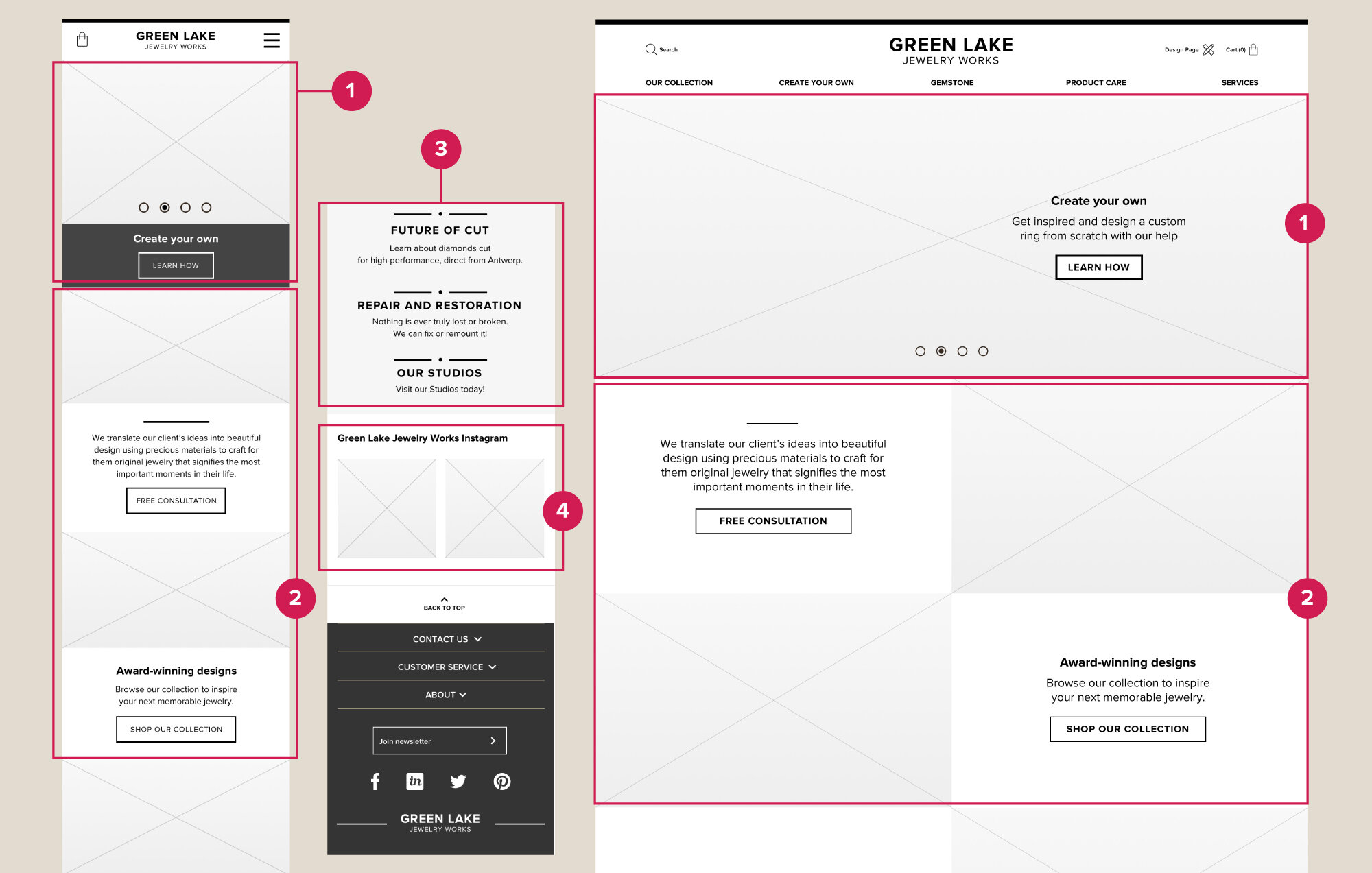
Home page needs to orient user to understand business offerings and services. It should answer questions like: “where am i?”, “What can I do here?”, “Why should I do it here?” The updated home page prototype display service offerings, sales, call-to-actions. Hamburger menu
1
The first content are carousel of four imagery that can be changed seasonally.
2
Three main content on the homepage highlights free consultation, Award-winning Designs, Fair Mines
3
Clickable text link that highlights other offerings
4
Link to instagram
CREATE YOUR OWN PAGE
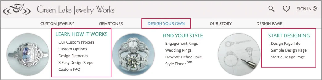
Pain points:
Under “Design your own”, There are 3 sections with multiple pages under them. There are 5 tertiary pages under “Learn how it works” and 3 pages under “Start Designing”. This is too much information to consume at once.
We don’t want to overload customer with all of information on the primary navigation. Certain information should come after certain steps.
SOLUTION: SIMPLIFIED CREATE YOUR OWN PAGE
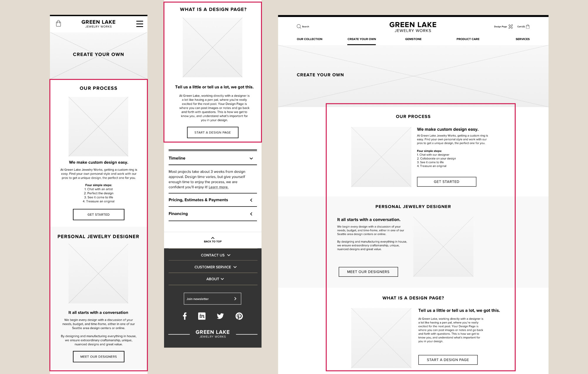
Create your own is a plece where user can learn about custom jewelry process. The page offers deep dive into three offerings: Custom jewelry process, Personal jewelry designer, and Design Page.
VISUAL DESIGN
After interaction design process above, the next step is to add branding and visual design. Inspired by Green Lake Jewelry studios, I went with earthy colors and their original imagery.